About
Suhyun is a brand and graphic designer based in Singapore, having moved here from South Korea in 2023. She works in both English and Korean, across food and beverage (F&B), lifestyle, fintech and craft-based brands.
Her work sits between brand identity, packaging, editorial and spatial design. She does not separate these disciplines as most projects require an interdisciplinary approach. She has developed identities for a pop-up retail store, brand systems for multi-outlet F&B groups and campaign content for fintech and banking clients.
Suhyun is especially drawn to usually small, specific brands—a neighbourhood bagel shop, a perfume workshop, a pop-up market—spaces where design shapes how people experience a place.
Outside of work, Suhyun takes photographs, sketches by hand, and observes how Seoul and Singapore do things differently. She is open to new collaborations, and welcomes opportunities to connect.
OHWA — A symbolic translation of the face into the five colors of obangsaek.
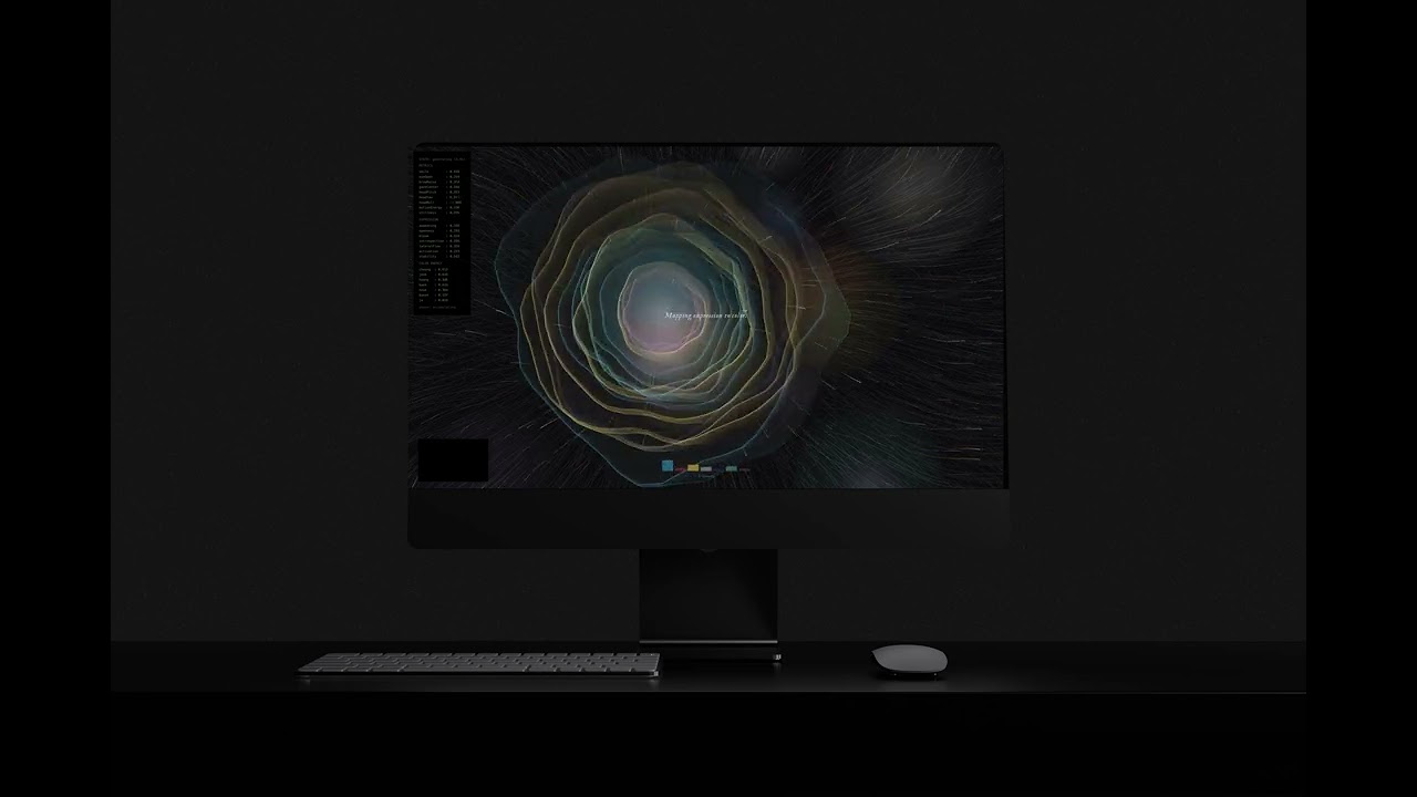
A glimpse of OHWA running. The face stays still, and the screen does the moving — particles drifting outward, colour settling in from the edges. Every session unfolds a little differently.
OHWA (오화) — A Symbolic Translation
Concept OHWA is a generative web piece that turns the face into a portrait made of obangsaek—the five colours from Korean tradition. Instead of trying to look like the user, it translates how the user shows up in that moment into colour and form. A portrait of presence, not appearance.
Experience The user steps close to the screen and holds still. The camera reads the expression in real time, and the screen starts to bloom—petals of light, threads of colour, particles drifting outward. Every session looks different, because every face does. No two compositions are ever the same.
Philosophy A portrait does not have to record a person's face to record who they are. This formed the starting point. People are now surrounded by images of themselves, and most of them feel less like being seen and more like being filed away. OHWA tries the opposite—using cultural memory instead of a camera roll, so being looked at can feel a little closer to being honoured.
Tools p5.js, MediaPipe Face Landmarker, HTML/CSS, JavaScript
Live at ohwa-korea.netlify.app


The OHWA book was designed as a printed companion to the web piece. Suhyun wanted the system that lives on screen to also exist on paper, so the book walks through the project's foundation, from the traditional Korean patterns it draws on to how form becomes translation.

Stickers printed from the seven pattern modules. Suhyun wanted the visual language to extend beyond the screen, so she turned the symbols into something you could hold, peel and place anywhere.

The OHWA archive box, gathering the project's printed pieces, stamps and keepsakes in one place. Since the digital experience is designed to leave no trace, Suhyun wanted a physical version of OHWA to keep, open and revisit.
noci bakehouse — Full Brand Identity, Concept to Launch

Branding and visual identity development for Noci Bakehouse, a warm countryside-inspired bakery concept in Singapore.
Noci Bakehouse — A Countryside Bakery in Singapore
Concept Noci Bakehouse is a bakery brand in Singapore that Suhyun built from the ground up from naming and concept to the full visual world. She wanted it to feel like a small countryside bakehouse: soft, warm and a little worn-in—the kind of place people would want to linger in, not just walk into and leave.
Role Suhyun was the only designer on the project, so every decision passed through her. She developed the concept and brand identity, as well as the visual media design. She also designed the interior visual details, storefront, signage and packaging. In addition to developing social media content, she managed the brand's Instagram allowing the world she designed offline to continue living online.
Approach Instead of treating the logo as the brand, Suhyun treated the whole space as the brand. Warm tones, natural textures, wooden details and handcrafted elements were layered into one quiet, rustic atmosphere—the kind of place that feels familiar even before you have ordered anything. Every layer, from the storefront to the Instagram feed, was designed to carry the same softness, so the brand feels continuous wherever you meet it.
Outcome Noci Bakehouse opened recently in Singapore. Seeing the concept she started on paper become a real, working space — with real customers walking through the door — has been the most rewarding part of the project so far.
Visit @nocibakehouse
Client Goldmoon Group · Marketblue

Translating the noci bakehouse identity into a real space — from the shopfront to the smallest in-store details, every surface carries the same quiet, warm tone.

The identity carried through merchandise, displays and small interior moments, designed to feel cohesive without ever feeling staged.
KK MARKET — Bringing the Korean Market to Marketblue

A glimpse of KK MARKET in motion. The pop-up brought the warmth and texture of a Korean market into Marketblue for a short run.
KK MARKET — A Pop-Up at Marketblue
Concept KK MARKET is a pop-up store that brings the energy of a Korean street market into Marketblue. The idea was to take the everyday parts of Korean shopping culture — handwritten signs, bright packaging, the slightly chaotic but warm atmosphere—and turn them into a short retail experience. Not a polished version of Korea, but the lived-in one.
Role Suhyun was the lead designer, taking it from concept to launch. This meant building the brand identity from scratch, designing the spatial layout, producing all the in-store graphics and shaping how products were displayed across the space.
Approach Instead of treating identity, space and product display as separate problems, she worked on them as one continuous experience. The same hand-drawn type that appeared on the logo showed up on the price tags, signage and wall graphics—so wherever the customer looked, the world stayed consistent. The space was built to feel like a place you walked through, not a backdrop you stood in front of.
Outcome The pop-up ran at Marketblue and brought the brand to life as a full sensory environment—visual, spatial and tactile. It became one of the projects she is most proud of because she got to design across every layer of a brand at once: identity, space, graphic and experience.
Client Goldmoon Group · Marketblue

A look across the floor of KK MARKET, opened as the 'Seoulful Spring' edition. Suhyun designed the entire visual environment, from the cherry-blossom canopy to the directional signage and zone markers, so the whole space could feel like one walkthrough experience rather than a series of separate booths.

Up close: branded tablecloths, signage and the way Korean products were staged across each booth. Suhyun wanted the design language to stay consistent down to the smallest touchpoint, so every brand inside KK MARKET was part of the same world.
Low Woon Sing, Kylie

Wang Chuting

Trevor Wee
Shazlyn Anisah Saiful Imran

Wee Wan Ming
Valencia Prisha Cassandra Malonzo
