
Seri Batrisyia Balqis Abdul Hafiz


About
Trisyia is a graphic design student drawn to clean, minimal design and thoughtful visual composition.
Her practice focuses on creating clear and refined layouts, where simplicity becomes a way to communicate ideas with intention. She is particularly interested in how typography, imagery and spacing work together to form balanced and cohesive visual systems.
She focuses on detail, often exploring how subtle adjustments can shift the way a design is experienced. Through this approach, she aims to create work that feels calm, considered and visually engaging without being overwhelming.
Trisyia believes that strong design does not always need to be loud, instead it can communicate effectively through clarity and restraint. Alongside her design practice, she enjoys photography as a way to explore composition, framing and visual storytelling. It allows her to experiment with perspective and observe how small details can shape a larger narrative. This interest often informs her design work, influencing how she approaches image-making and layout.
Through her projects, she aims to translate ideas into thoughtful visual outcomes that are both aesthetic and purposeful. She is interested in creating work that invites quiet engagement, where viewers can take time to notice details and connect with the design in a more reflective way.
RAWAT
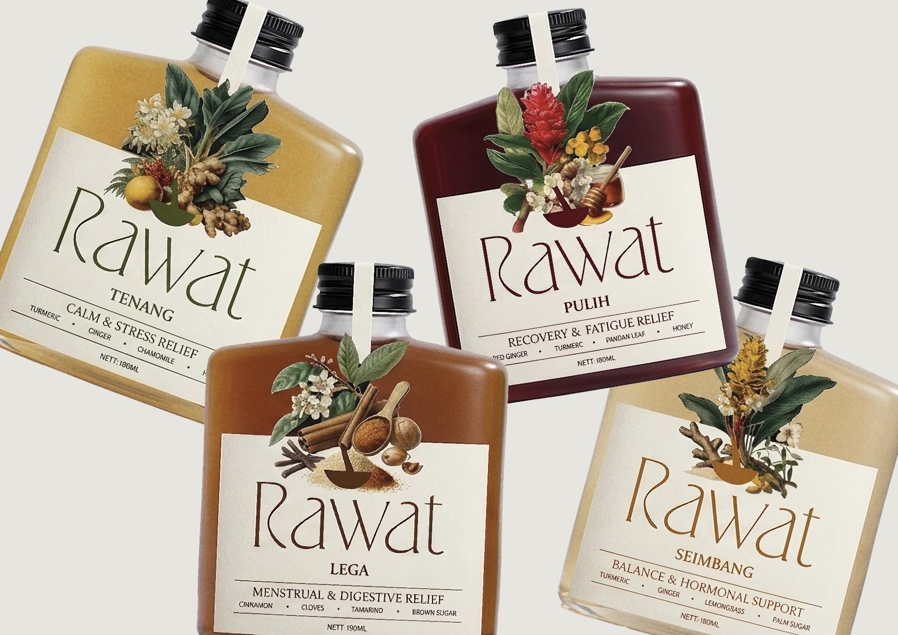
Rawat is a contemporary interpretation of traditional jamu, a Southeast Asian herbal practice rooted in daily wellness and women’s care. The project reimagines jamu through a modern design lens, translating its cultural and functional values into a clear, accessible and visually cohesive system.
Focusing on themes of balance, recovery and calm, Rawat presents herbal drinks that support everyday wellbeing while staying grounded in traditional knowledge. Each variant is thoughtfully developed using natural ingredients such as turmeric, ginger and lemongrass, reflecting the original purpose of jamu as a holistic, preventative practice rather than a commercial product.
The design approach emphasises clarity and minimalism, using clean layouts, refined typography and a considered use of colour to communicate each drink’s function. This creates a calm and structured visual language that contrasts with the often complex and informal presentation of traditional jamu, making it more approachable for a contemporary audience.


RE
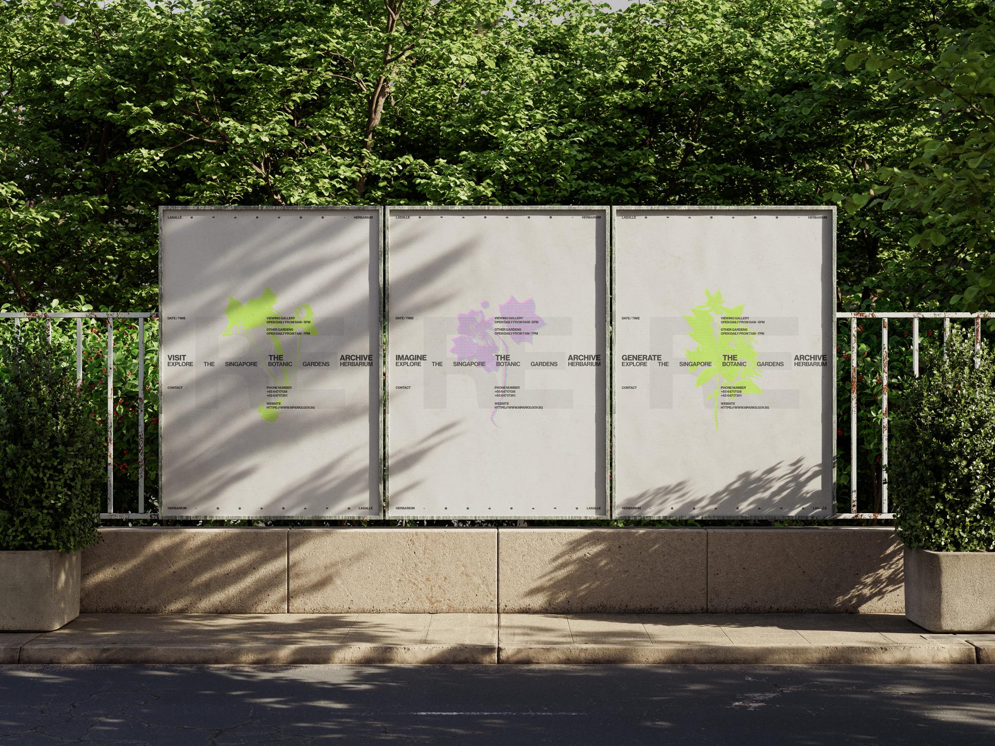
In the Herbarium, digitalisation becomes an act of renewal, revisiting the delicate balance between birth and decay. Each digital copy carries knowledge from the past into the future, suggesting that death is not an end, but a beginning.
*RE is a conceptual campaign that reimagines the Singapore Herbarium as a living archive. Rooted in transformation rather than preservation alone, it explores how archived plant specimens evolve into digital forms that continue to grow through memory and connection.
Anchored by the asterisk (*) as a symbol of regeneration, RE shifts the Herbarium from a static collection into an ongoing process, one that expands not through leaves or roots, but through understanding.


Catherine Juliez Velim
Sanjana Venkat

Quân Phan
Kim Sungwook

Eqa’Umyrah Putri Mohammed Adam

Muhammad Asif Nawfal Bin Noor Hairin