About
Alda is a graphic designer dedicated to crafting innovative and impactful visual solutions that live at the intersection of strategy and art.
With a core expertise spanning visual communication and digital media, her work embodies a unique balance of creative exploration and technical precision. She believes that great design is not just seen but felt, and strives to create thoughtful visuals that captivate, inspire and drive meaningful engagement.
A defining element of Alda's creative process is a strong proficiency in illustration and drawing. By integrating bespoke illustrative elements into her work, she is able to provide a level of personality and custom craftsmanship that sets her designs apart. Whether she is developing a brand identity from the ground up or refining a digital interface, her ability to visualise concepts through drawing allows for more fluid and imaginative problem-solving.
With a professional background encompassing branding, UI/UX and interactive design, Alda approaches every brief with a detail-oriented and strategic mindset. Her experience collaborating with design teams and working on real-world client projects has honed her ability to interpret complex briefs and deliver high-quality solutions that resonate with diverse audiences.
Alda is committed to pushing the boundaries of visual storytelling to deliver results that are as functional as they are beautiful.
Bob Ross : Happy Little Trees
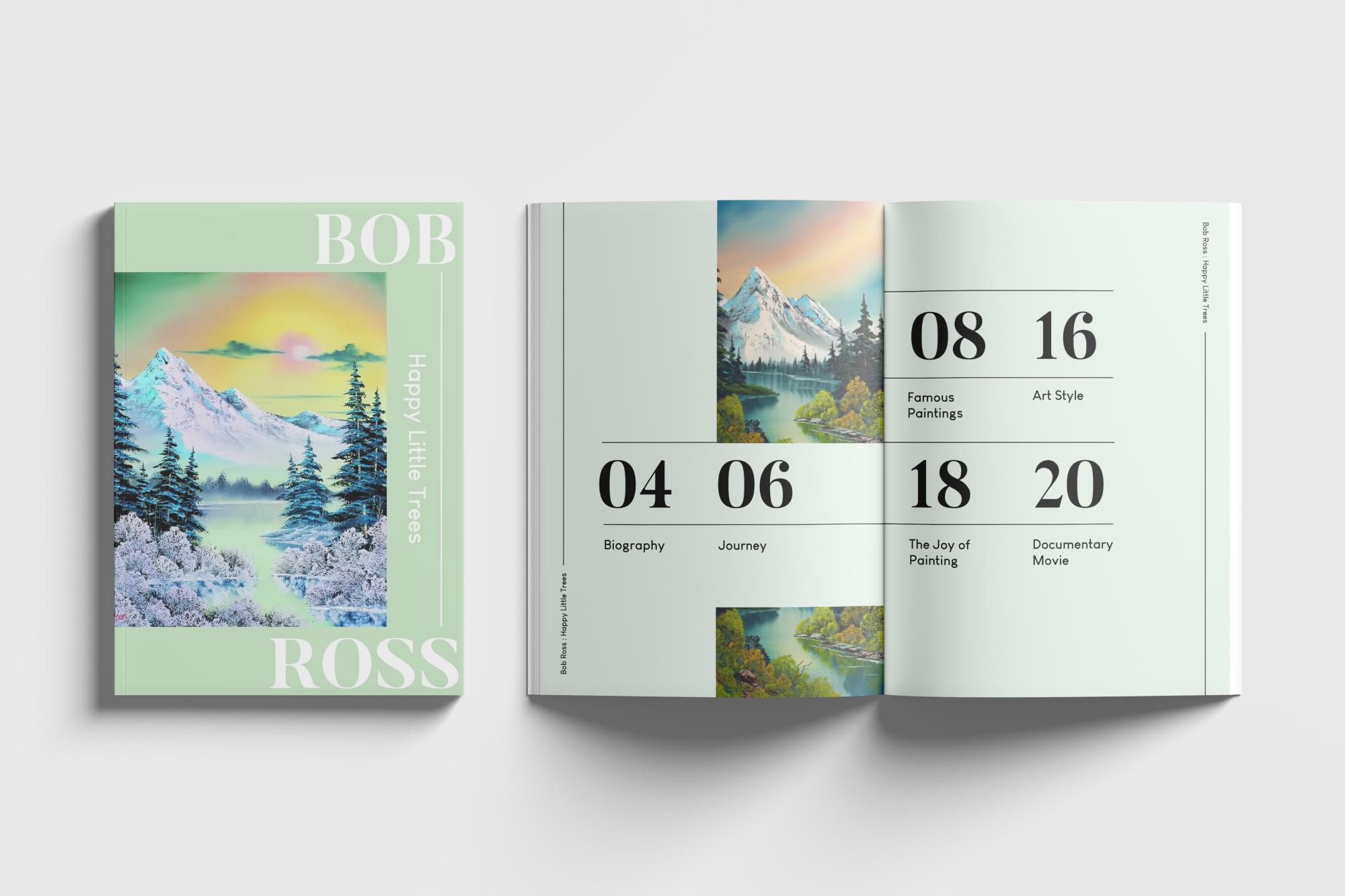
This physical publication celebrates the legacy of Bob Ross, incorporating his signature colour palette to reflect the essence of his art style.
The design draws inspiration from his calm presence and approachable teaching style, translating these qualities into a thoughtful layout and visual system.
Through curated content, typography and image treatment, the publication aims to capture both the artistic and personal aspects of his legacy.


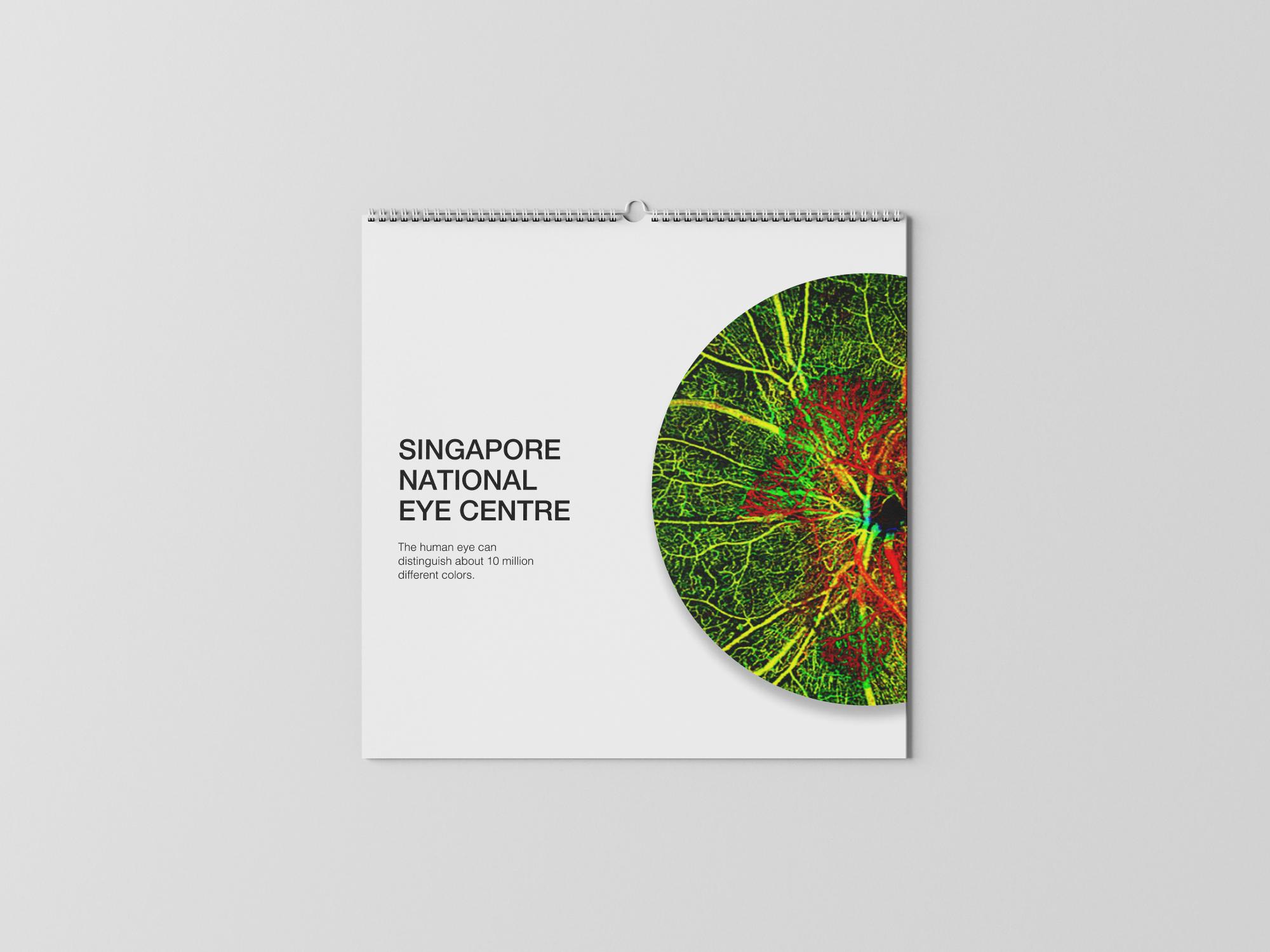
SNEC Calendar (Pitch Work)

During her internship, Alda developed a pitch proposal for the Singapore National Eye Centre (SNEC) 2025 Calendar.
Based on the client’s brief, she designed the cover page, back page and a sample calendar day layout, incorporating SNEC's graphics to ensure alignment with their visual identity.
The proposal focused on creating a clean, cohesive and functional design that balanced branding with clarity and usability.

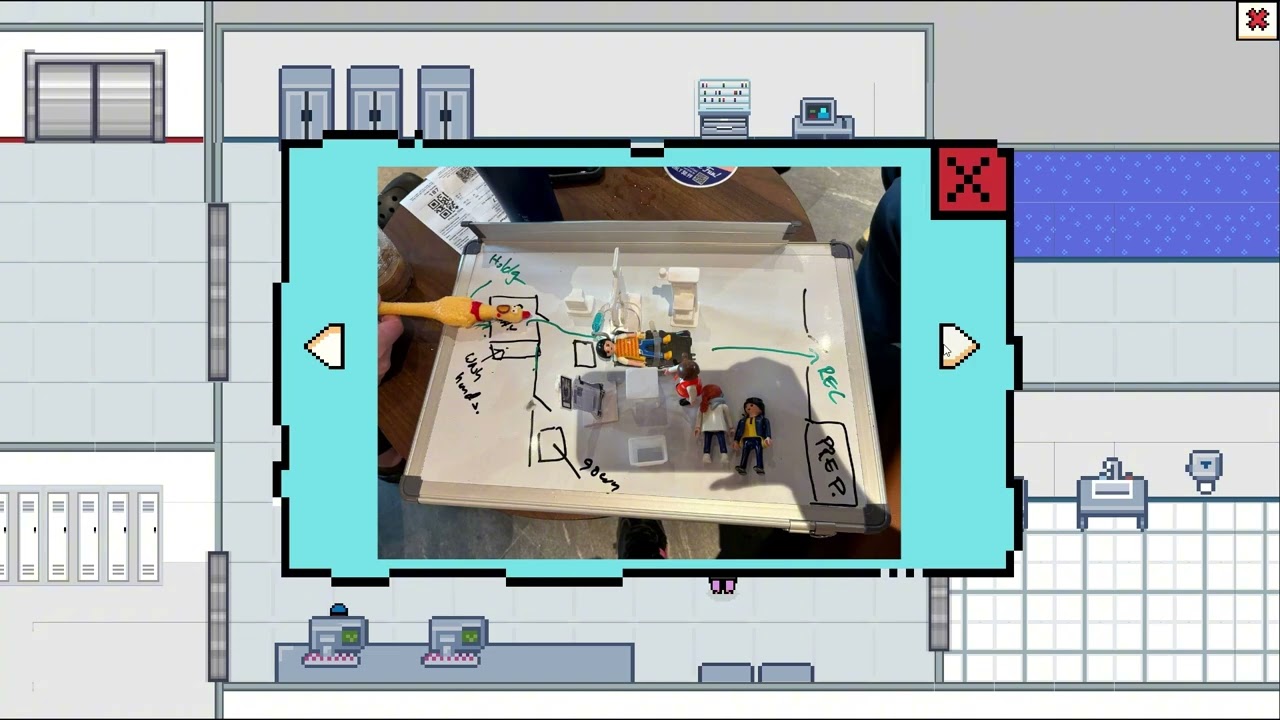
Fridge App

This UI/UX project envisions a smart fridge app designed for Smeg, integrating its pastel and green colour palette to reflect the brand’s retro-modern aesthetic.
The interface is crafted to provide a seamless and visually cohesive user experience, aligning with Smeg’s elegant yet functional design language. Key features include inventory tracking, expiration reminders and door tracker, helping users efficiently manage their fridge while maintaining a stylish, intuitive interface.
This project blends technology and design, enhancing everyday convenience with a fresh and sophisticated user experience.


Low Woon Sing, Kylie

Dave Yu Warsanta

Qireen Idris

David Sakthivel

Parisha Agarwal

Lim Bridget