
About
Catherine has spent the last two years exploring different ways of creating and thinking through design. She has experimented with colours, layouts, typography and building visual identities, while figuring out what kind of designer she wants to become.
Dance has always been a big part of her life, and has naturally influenced how she sees and makes things. The sense of rhythm, movement and flow in dance often carries into her design work, shaping how she builds compositions and tells visual stories. She tends to think of design as something that moves and feels, rather than something static.
In school, Catherine has found herself really drawn to branding projects. She enjoys thinking about how a brand can feel like a personality, and how that can be expressed through visuals like logos, colours and even the overall atmosphere it creates. She likes to create identities that feel alive and honest, which connect with people beyond just how they look.
Most of what Catherine does revolves around exploring ideas, trying different approaches, and slowly refining her style through her projects.
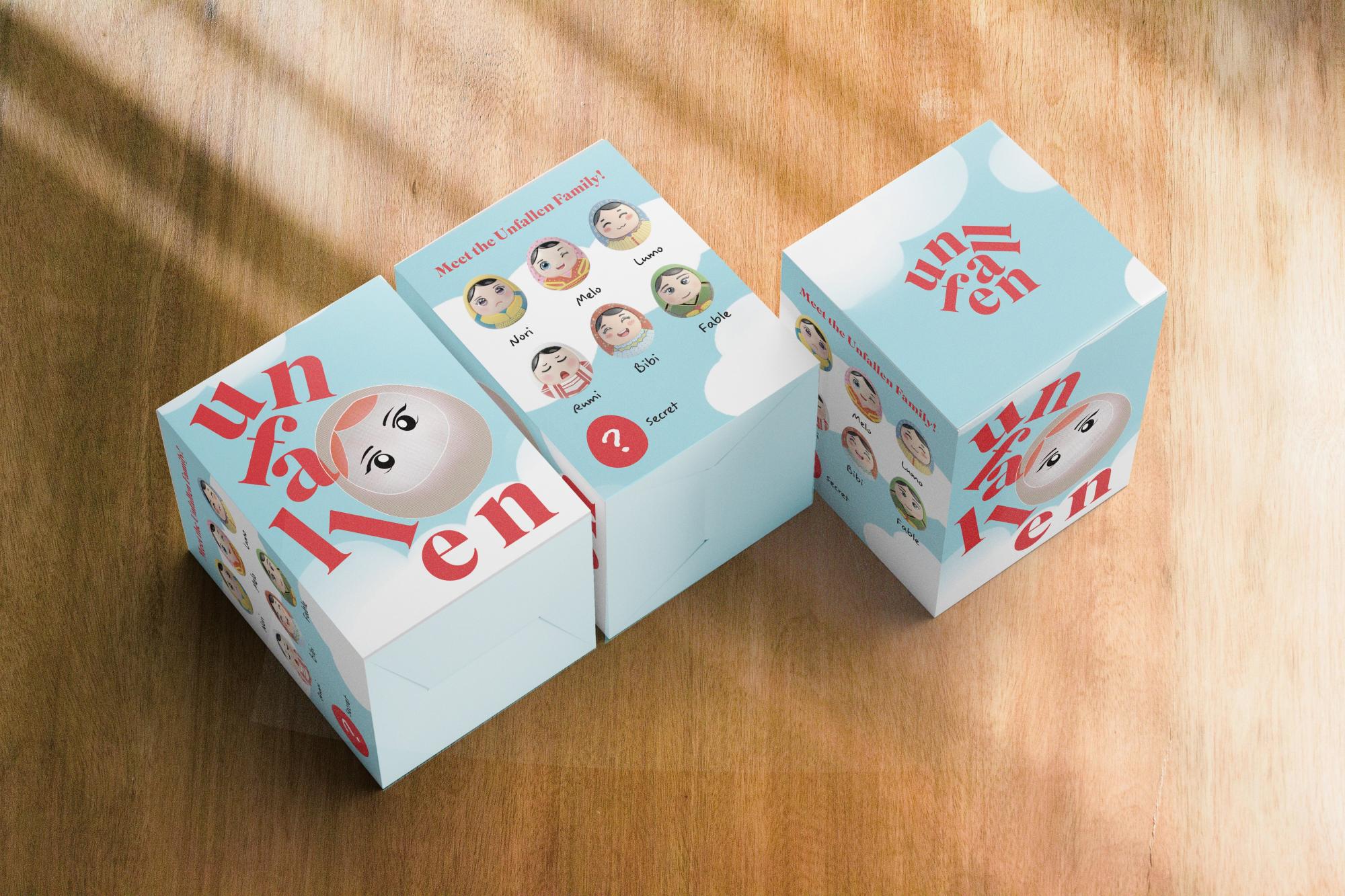
D'antara

Floating above Labuan Bajo
A contemporary dining experience rooted in Bajo sea culture
Floating above the waters of Labuan Bajo, this restaurant reimagines the region through the lens of the Bajo people—sea nomads deeply connected to the ocean.
Their stilted homes, boats and way of life reflect a culture shaped by the sea. Positioned as a cultural storyteller, the restaurant translates this heritage into a contemporary dining experience for a global audience.
At the same time, it challenges outdated perceptions of Labuan Bajo’s cuisine by elevating traditional dishes through refined presentation, revealing their richness, depth and quiet sophistication.


Built For Balance: Spaces That Heal

Spaces have the power to heal by gently holding those within them, much like the two characters embracing the building. The larger figure represents care and protection, wrapping the space in warmth, while the smaller one reflects curiosity and trust, reaching toward it with ease.
Together, they mirror how thoughtfully designed environments support both comfort and exploration. Soft colours, open forms, and quiet details allow the mind to rest and the body to feel at ease.
In these spaces, people are not just sheltered but nurtured, creating a sense of balance where healing happens naturally and connection feels effortless.


Trading Cards

In Year 1, Catherine designed a series of trading cards inspired by selected artists, translating their distinct visual styles into a collectible format.
Each card explored elements such as colour palettes, composition, textures and illustration techniques unique to the chosen artist, while adapting them into her own interpretation.
The process involved researching their artistic language and reimagining it through layout, typography and character design.
By working within the structure of trading cards, she learned to balance consistency and individuality, ensuring each piece felt cohesive as a set while still reflecting the essence of different artistic influences.


Lionel Fong
Ng Lei Kee
Claire Boon
Alicia Lim

Koh Hui Chin

Wint Thiri Ko (Riley)