About
Kavya believes the most meaningful work happens when disciplines intersect, where design meets storytelling, strategy connects with emotion, and ideas move across mediums.
Whether she is crafting a visual identity, shaping a narrative, or developing concepts late into the night, she is drawn to creativity that does not stay in one lane. Design is never only visual, and storytelling is never limited to words; each informs the other, creating work that feels thoughtful, layered and emotionally engaging.
Kavya approaches creativity as both a practice and a perspective. Curious about how people experience communication, she is fascinated by how visuals shape perception, how language builds connection, and how details such as colour, typography, or tone can transform meaning. She is driven by the belief that creativity is not just about making things look compelling, but about creating ideas that genuinely resonate.
Rooted in curiosity and experimentation, Kavya is constantly exploring new ways to communicate, connect and create. She values interdisciplinary thinking, meaningful collaboration and projects that challenge her to grow beyond familiar boundaries.
For Kavya, creativity is more than a single medium. It is an evolving way of seeing, understanding and shaping the world through ideas that matter.
Borrowed Voices of Hyderabad
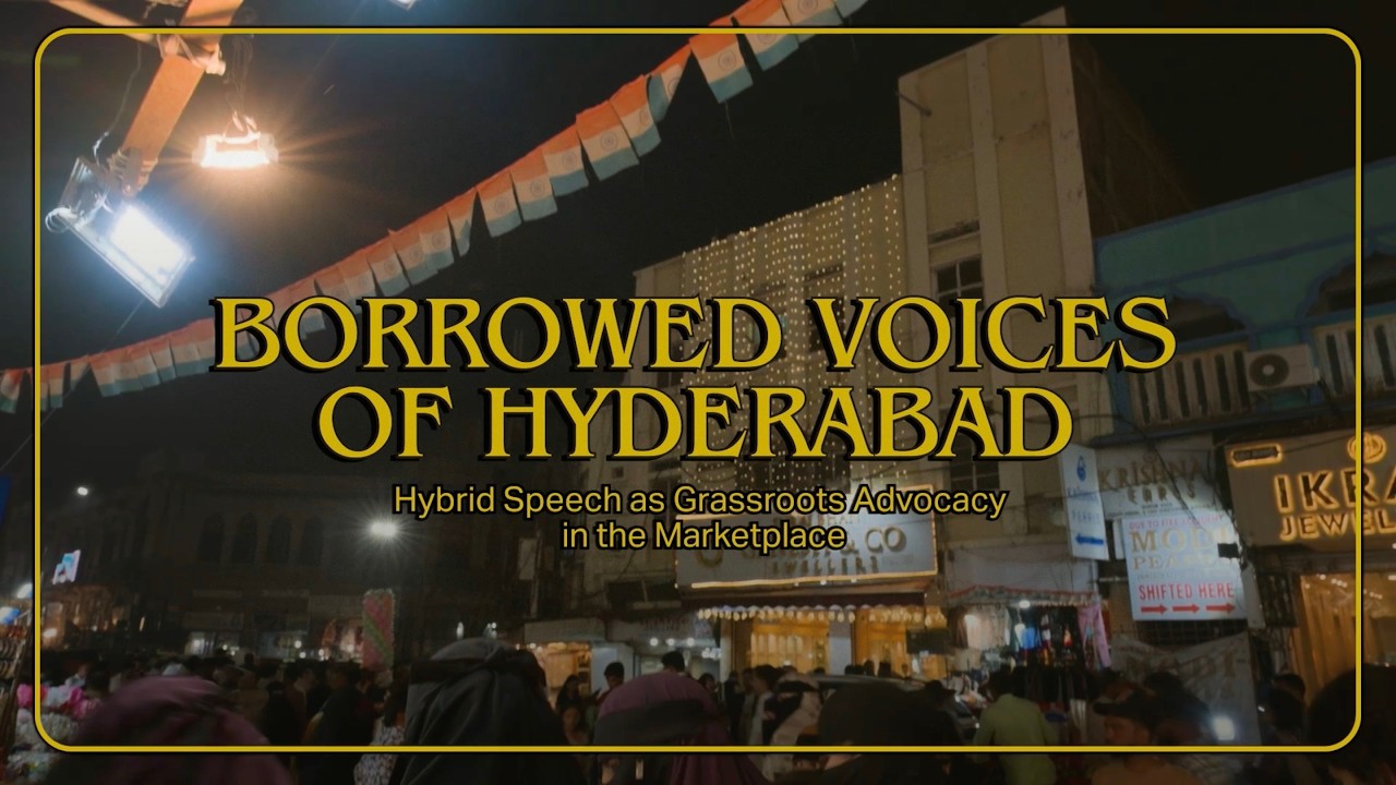
This documentary explores how street vendors in Hyderabad use hybrid language practices to communicate across cultural boundaries. Through everyday interactions, these shifts become subtle forms of inclusion and grassroots advocacy.
This project investigates code-switching in Hyderabad's street markets as a form of grassroots advocacy.
Through ethnographic research, it reveals how vendors fluidly shift between Telugu, Hindi, Urdu and English to create inclusive, accessible interactions. Positioning the market as a third space, the work highlights language as a lived, adaptive tool that fosters belonging, builds trust and challenges linguistic hierarchies. Vendors create their own systems of communication to overcome language barriers.
Through semi-structured interviews, audio, and visuals, the project presents language as something flexible and lived, showing how identity, negotiation, trust and belonging are built through these small, daily exchanges.


Interview booklets

Pocket-Lingo

Market archive
Forest Felony
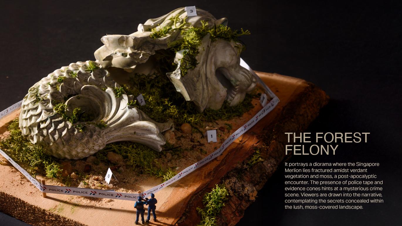
A reimagining of the Merlion, this project explores the transformation of national symbols when removed from their original cultural context. Instead of presenting it as an icon of identity and tourism, the Merlion is positioned as an archaeological relic discovered in a speculative, post-apocalyptic future.
The diorama constructs a surreal narrative where the structure is no longer celebrated but observed, guarded and questioned. The inclusion of figures such as policemen introduces a sense of control and ambiguity, suggesting that the relic holds unknown significance or power. This shift reframes the Merlion from a familiar landmark into an object of curiosity, investigation, and reinterpretation.
It reflects an approach to design rooted in storytelling, where familiar symbols are disrupted and recontextualised to explore how meaning evolves over time.


Paula Scher (Publication)
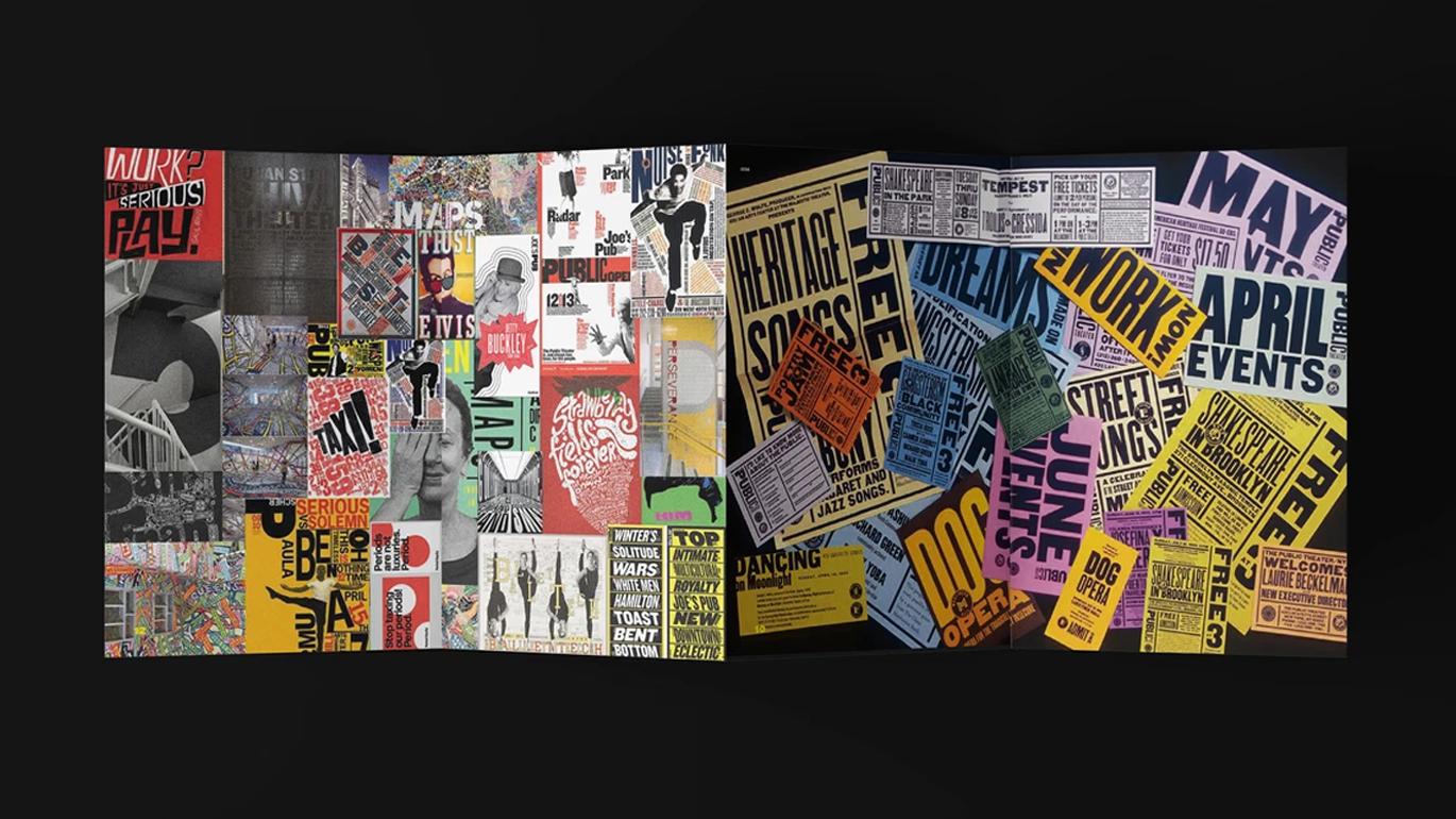
This publication explores the work of Paula Scher, focusing on her bold approach to typography and layout.
The project examines how scale, composition, and colour create expressive and engaging visual communication. A range of typographic treatments and layout systems were explored to develop a dynamic visual language influenced by Scher’s style while maintaining a distinct approach. A key challenge was balancing creative exploration with structural constraints, particularly ensuring the page count suited saddle stitch binding.
The project strengthened an understanding of hierarchy, pacing and readability, highlighting the balance between creativity, structure and functionality in publication design.


Ong Cui Yi

Ramanathan Aparna (Abhi)

Cao Yaqi

Nayli Kamilia Kaisah Binte Reza Ali

David Sakthivel

Jay Hezekiah
