

About
Gabrielle Jose Valencia is a graphic designer, illustrator and writer whose practice is an inquiry into lived experience and cultural memory.
Her name reflects layered histories and cultural crossing, much like the practice she continues to build. Over the years, she has moved across different forms of art—from writing to interior and graphic design. As she developed a stronger focus on graphic design, she recognised a consistent thread across these shifts: using her creative practice to shape narratives that remain deeply rooted in cultural influence.
She navigates illustration, image and text as interconnected languages, often utilising zines and experimental publishing to explore how memory and history appear in fragmented, yet deeply connected ways.
Rather than forcing a resolution of meaning, Gabrielle uses image-making and writing to create spaces where ideas unfold slowly. Her work invites a quiet, active reflection, aiming to produce visual stories that linger well beyond the moment of viewing.
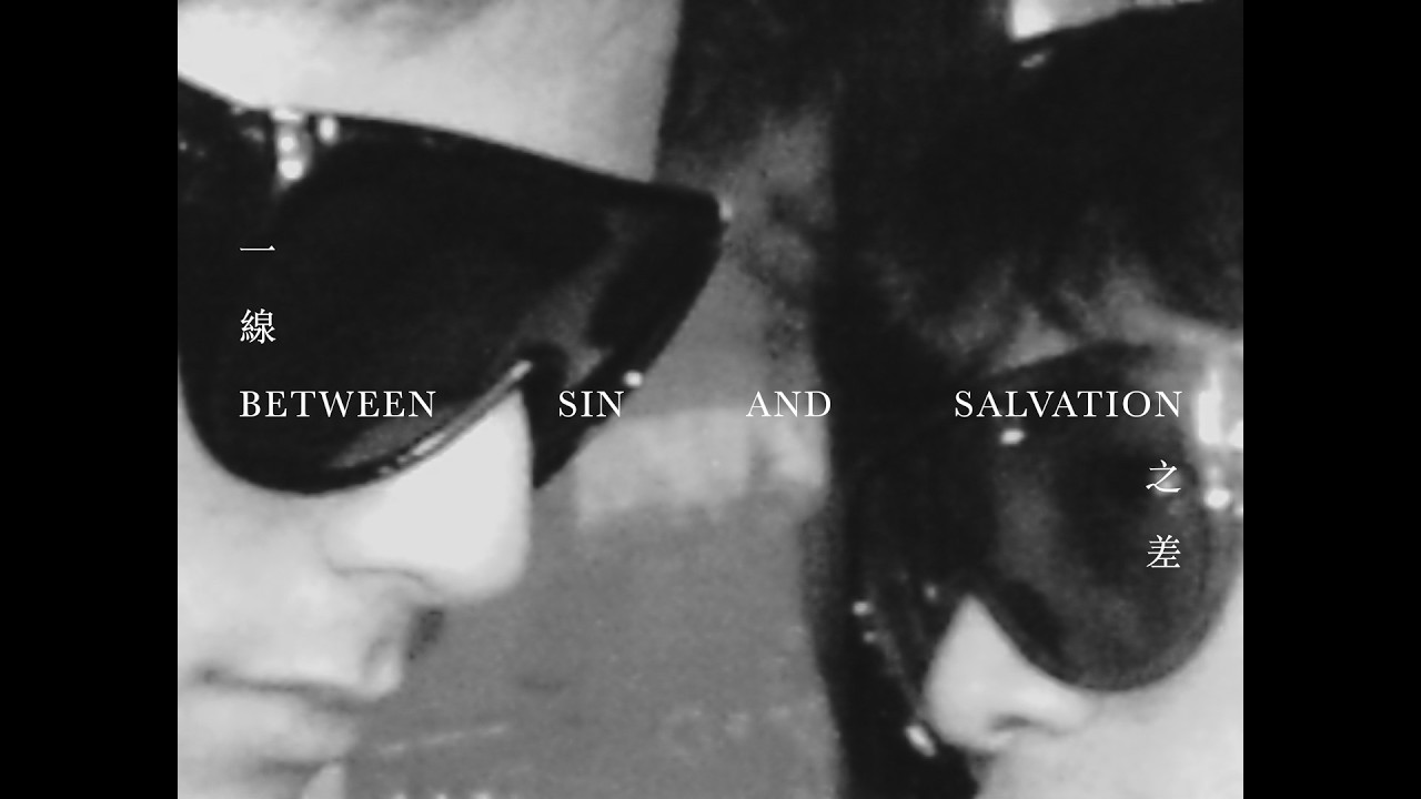
The Tropical Gothic

The Tropical Gothic is a proposed three-day Philippine Independence Day festival branding identity that confronts inherited colonial systems embedded in spaces, bodies, minds and everyday life.
It begins with the question: “Is there a way to confront colonial trauma without alluding to bloodshed and violence?” Inspired by the postcolonial literary genre coined by Nick Joaquin, the project uses unease in a tropical atmosphere and ancestral mysticism as lenses for examining colonial trauma.
Set within Manila’s former colonial centre, the district-wide activation reimagines Independence Day as an ongoing site for reflection, confrontation and collective imagination. Rather than framing independence as a completed milestone, the festival positions it as a lifelong and unfinished practice.


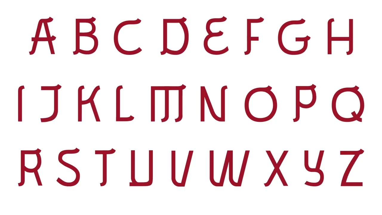
Hubris

Hubris is an experimental typeface based upon a speculative concept which asks, "what if letters weathered like rocks?"
It draws inspiration from the natural phenomenon of weathering, where the solid strength of rocks gradually breaks down over time, revealing its simplest form.
Letterforms appear as if they were subjected to the passage of time, with pieces seemingly missing or worn down, revealing the essence of the letter in its simplest possible form: rounded lines.
The typeface attempts to capture the tension between what is solid and unyielding versus the eventual smoothening and dissolution that comes with time.


Materialised Futures

Materialised Futures is a proposed festival branding identity for the 19th edition of Singapore Archifest.
There exists a contemporary cultural condition in which designs prioritise visual aesthetics and instant impact over meaningful engagement with space and human experience—resulting in a sense of contrived depthlessness. In the hopes of resisting this, the project raises the question: “As humans evolved to build cities, how could cities evolve to better serve humans?”
A post-carbon city, a participatory and inclusive city and a vernacular city emerge as possible responses to the question raised —visions of future cities that place humans at its core. While envisioning these cities is one thing, to materialise them is another. This year’s proposed theme, Materialized Futures, celebrates the power of architecture to bring these imagined futures into existence.


Cheong Wen Xuan

Lee Woosuk

Mitchell Hoo Min Cher
Clemence Chew
Li Jiajia

4:40am
