
Shamen Haykal Bin Abdul Syakur

About
Shamen is a visual communication designer with three years of experience, driven by a strong interest in storytelling, cultural narratives and concept-led design.
His work explores the intersection of editorial design, branding and typographic art direction, aiming to translate ideas into visually compelling and emotionally resonant outcomes.
Shamen approaches design with a strategic mindset, grounding his concepts in research, audience understanding and cultural context, while ensuring each visual decision contributes meaningfully to the overall narrative. He is particularly drawn to projects that highlight identity, representation and human connection, using design as a medium to amplify voices and bring overlooked stories into focus.
Proficient in Adobe Creative Suite softwares including Photoshop, Illustrator, InDesign and Premiere Pro, Shamen is confident in developing both print and digital outputs, with a growing focus on refining execution to match strong conceptual thinking. He is also experienced in editing tools such as Canva, Figma, CapCut and DaVinci.
Shamen strives to create work that is not only aesthetically engaging, but also purposeful, thoughtful and relevant within today’s evolving cultural landscape.
Tone Magazine

Tone Magazine
Tone Magazine is a cultural publication exploring the identities of people of colour beyond surface perception.
Through beauty, music, sport and culture, it aims to redefine representation by highlighting lived experiences, creative expression and cultural influence. The magazine challenges media narratives that reduce identity to appearance, instead foregrounding individuality, depth and everyday cultural impact.


Tone Magazine: Beauty

Tone Magazine: Rhythm

Tone Magazine: Game
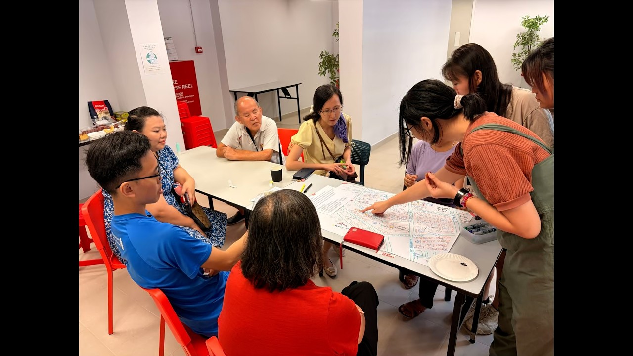
Singapore Writers Festival

Singapore Writers Festival posters mockup
The Singapore Writers Festival is one of Asia’s leading multilingual literary festivals, bringing together both international and local authors, as well as creatives across disciplines.
This project aims to develop an advertising campaign that promotes the festival and its unique cultural positioning. As one of the few multilingual literary festivals in the world, and rooted in Singapore’s diverse linguistic landscape, the campaign concept celebrates the written and spoken word across the nation’s four official languages: English, Malay, Chinese and Tamil.

Singapore Writers Festival brochure mockup

Singapore Writers Festival web mockup
Vogue Magazine (experimental & personal)

Vogue Magazine cover
This project explores the identity of a magazine brand through the development of its editorial layout. It uses Vogue Magazine as a key point of reference due to its global recognition and influence in the publishing industry. A self-initiated project, it draws inspiration from Vogue’s use of cover imagery, particularly its focus on models to convey identity and narrative. Similarly, this project seeks to express diverse identities through its front covers, using portraiture as a central visual device to communicate character, culture and story.
Initially conceived as a personal project, it began as a series of personal magazines created as birthday gifts for the author’s close friends. The cover photograph was captured using a mini digital camera, a single spontaneous shot taken in the middle of the road as part of a playful challenge among friends to see whether they are charismatic and worthy of a magazine cover. What began as a lighthearted moment evolved into a series that reflects authenticity, confidence and the energy often found within candid photography.
The contents of this magazine are strictly personal with no copyright claim.

Front and back covers

Personal contents of the dedicated model.
Celine Wong Zhi Qing
Clemence Chew
Gabrielle Anderson

Ayesha Mahmood

Jeong Sehyeok
Andrea Lau
