

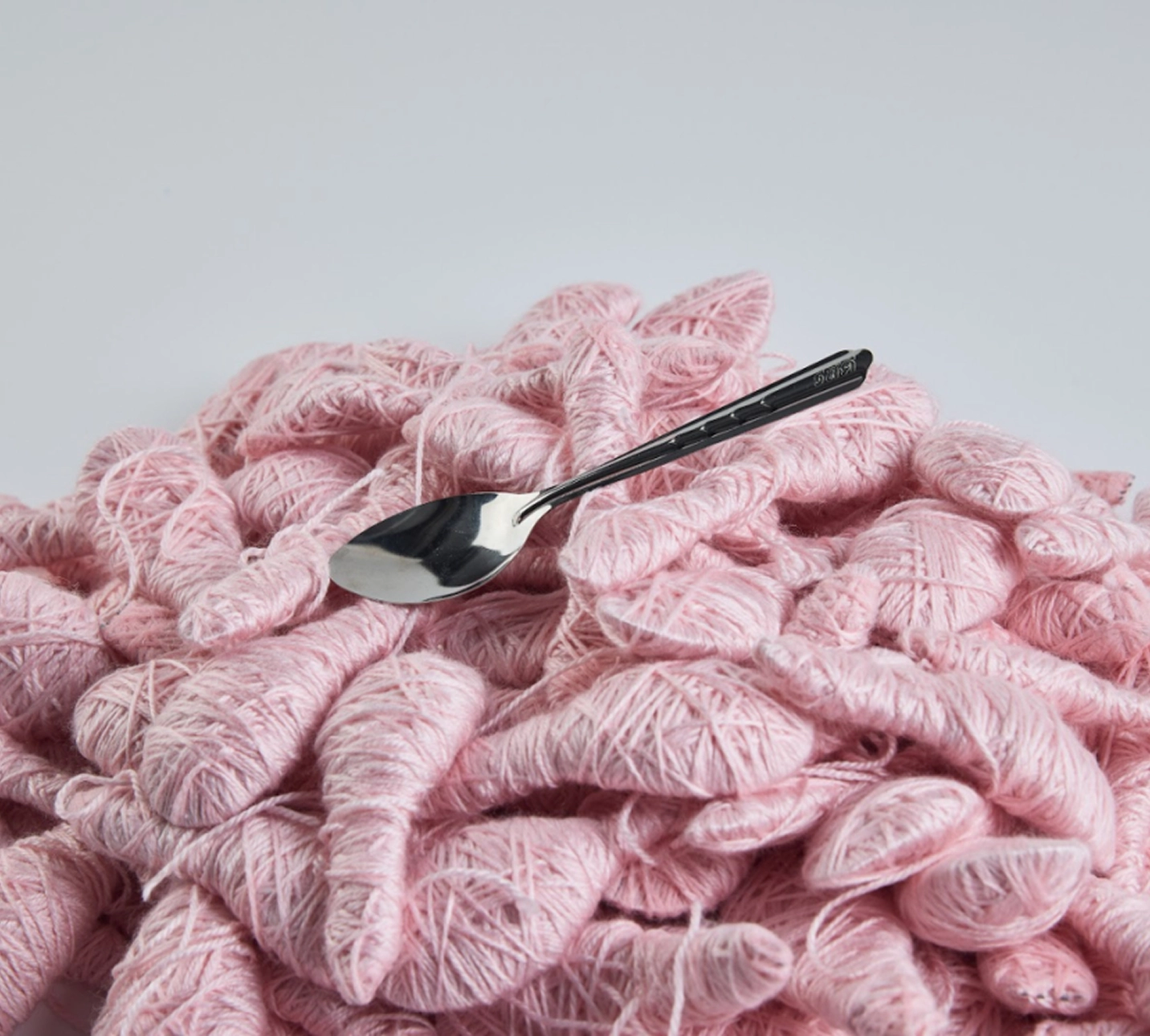


About
Phoebe is a Singapore-based graphic designer working at the intersection of research, behaviour and visual form.
Drawing inspiration from the behaviours, systems and environments around her, she reflects on these broader topics through considered visual work that spans branding, editorial and social impact contexts. She uses design as a bridge between concepts and the visual systems that make them legible.
Phoebe's practice is research-driven and concept-led, shaped by a curiosity that extends beyond the studio. Experimental in sensibility and process-driven, she also draws inspiration from outside of her discipline—including anthropology, language and architecture—to inform her visual decisions.
Outside of design, Phoebe finds inspiration across other creative worlds, particularly from worldbuilding, cinematography and storytelling in video games and film. She is also drawn to the hands-on making such as building Gundam kits, feeding her curiosity for material and structure while experimenting with finishes, textures and form in systematic ways that inform her design thinking.
Conceptual and restless by nature, Phoebe believes that learning is an ongoing process, and is drawn to projects where ideas carry weight and form follows thinking.
Sentio Centre
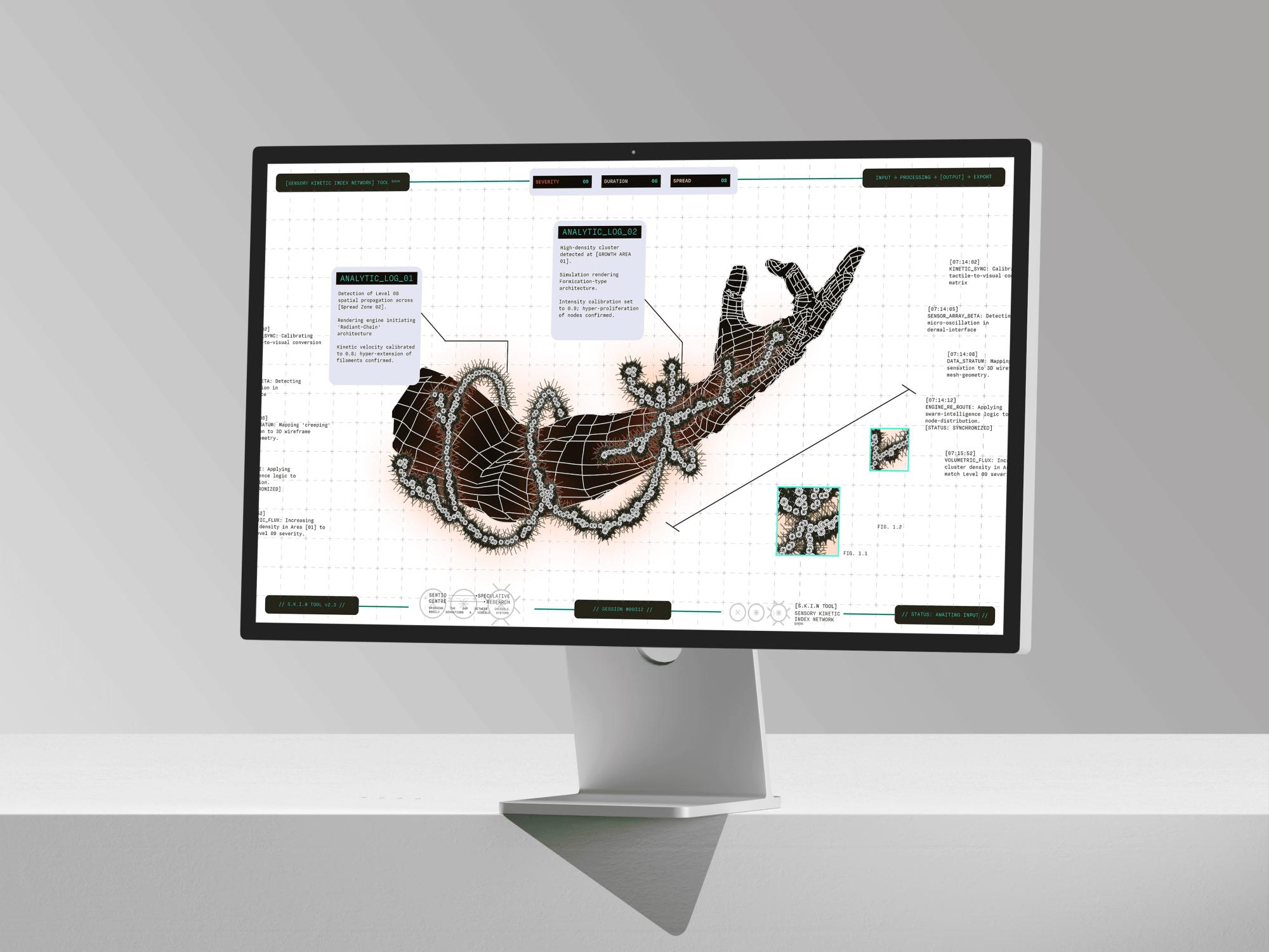
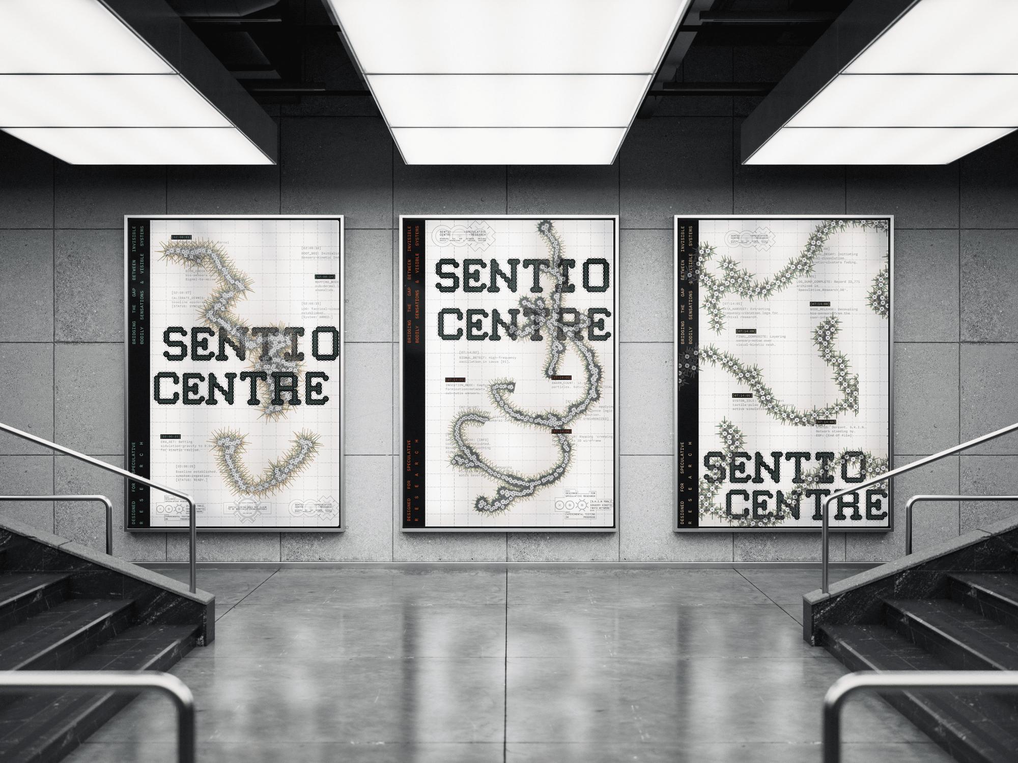
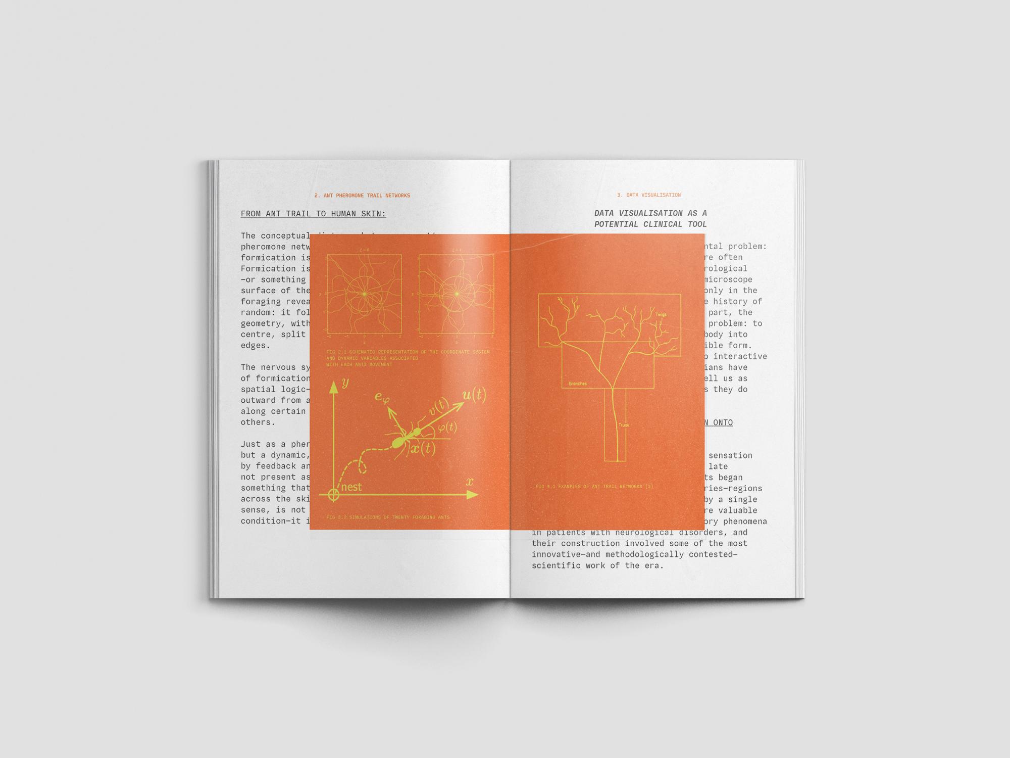
Inspired by a personal experience with formication, a sensory hallucination of insects crawling on or under the skin, Sentio Centre is a speculative research centre exploring how design can translate invisible bodily sensations into visible, communicable systems.
Formication is frequently overlooked due to its lack of visible evidence and the difficulty of describing it, leaving sufferers without language or validation. As people increasingly turn to digital spaces to understand their health experiences, design emerges as a potential bridge—translating subjective sensations into legible, shareable forms.
Sentio Centre's primary output is the S.K.I.N Tool [Sensory Kinetic Index Network], a generative body mapping instrument where symptom inputs—such as severity, duration, spread and sensation type—drive the structure and behaviour of visual outputs mapped onto a body silhouette. The project positions design as a functional interface for sensing and recording experience, transforming what the body feels but cannot easily show or say.


Merlion Does Not Come Out

Singapore's Merlion is fundamentally a queer figure—a hybrid of lion and fish, a creature that should not exist, yet has been absorbed so thoroughly into the nation's symbolic order that its strangeness is no longer viewed as strangeness.
This is precisely the logic that this project interrogates: the state's capacity to instrumentalise that which falls outside the norm, rendering it monumental, managed and safe.
Merlion Does Not Come Out uses the Merlion as a structural metaphor for the condition of queerness in Singapore—permitted only when it is contained, depoliticised and made to serve. Queerness becomes visible only through a carefully controlled lens—legible to the state, on the state's terms, in the state's frame. The repeal of Section 377A is emblematic of this: recognition extended without redistribution, acceptance without structural change.
The project refuses these terms and pushes back against a framework in which queer existence is tolerated only insofar as it remains legible to and unthreatening of a conservative state invested in the preservation of its own values. To exist only when you do not disturb is not to exist freely. Merlion Does Not Come Out insists on the right to exist outside the state's frame, on terms that belong to the community itself.


Palimpsest
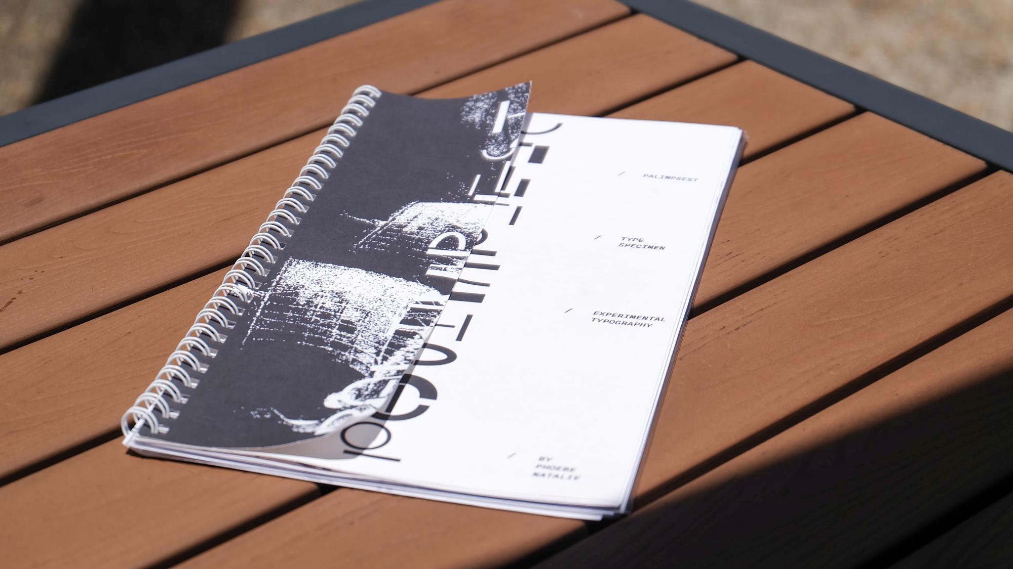
Palimpsest is a typeface designed for an open-ended experimental workshop.
The brief required a complete set of uppercase and lowercase letterforms built around a self-directed concept that prioritises the visual and conceptual translation of an idea over legibility, leaving room for genuine experimentation.
Palimpsest aims to explore the paradox of identity and transformation through the lens of the Ship of Theseus. By deconstructing and reconstructing letterforms using modular elements from subsequent letters, this project questions: At what point does a letter cease to be itself?


Shazlyn Anisah Saiful Imran

Masturah Maidin
James Tiah Li Qin
Calvino Kho
Joycey Y Tanesia

Cho Suho
