
About
Geraldine is a graphic designer based in Singapore with a background in commercial interior design.
Before pursuing the BA (Hons) Design Communication programme at LASALLE College of the Arts, she developed three years of industry experience as an interior designer, working on commercial projects from concept development to presentation. This experience shaped her practical understanding of design constraints, project timelines, client needs and collaborative workflows, which continues to inform her approach as a visual communicator.
Geraldine's design practice is guided by logic, curiosity and a strong problem-solving mindset. With experience across spatial design, branding, campaign development, social media content and digital design, she enjoys creating work that is both purposeful and visually engaging. Her previous roles allowed her to strengthen her project management skills, collaborate closely with teams and translate ideas into clear design outcomes across different formats.
Beyond graphic design, Geraldine has a strong passion for illustration, working with both traditional and digital mediums. This adds a personal and expressive layer to her creative process, allowing her to approach visual communication with sensitivity, storytelling and attention to detail.
Her portfolio reflects a range of work across branding, campaign design, UI/UX, social media, 3D visualisation, print and illustration, showing her ability to adapt across different creative contexts.
As a designer, Geraldine strives to create meaningful and joyful experiences through her work. She is interested in design that communicates clearly, connects with people and brings thoughtful ideas to life through both strategy and visual craft.
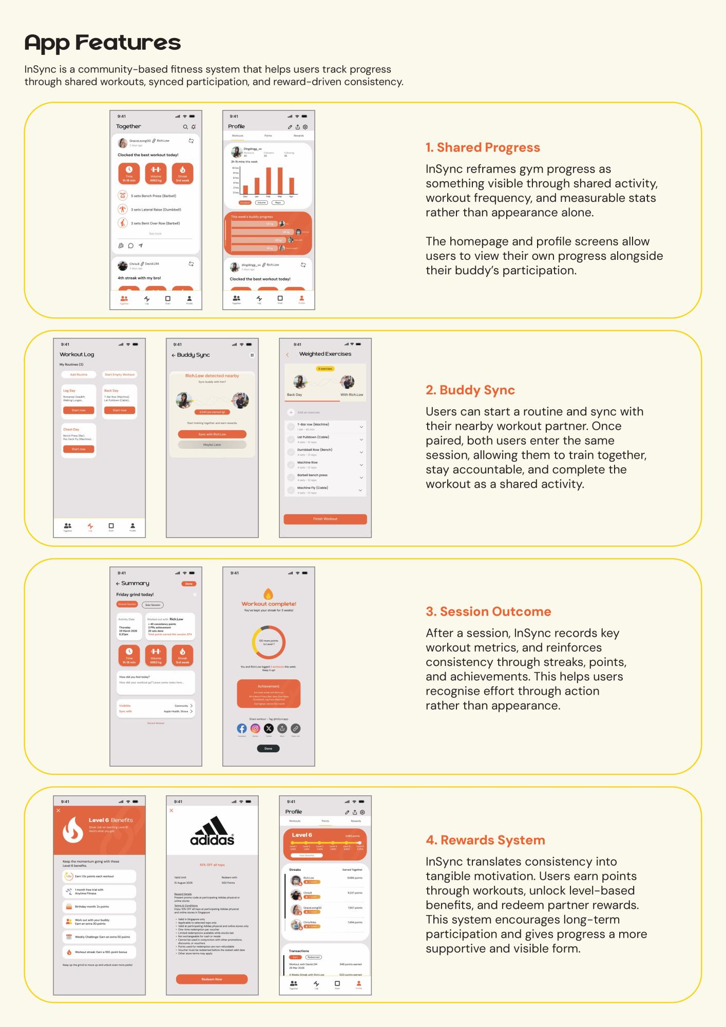
InSync: Reframing Gym Progress Through Shared Accountability
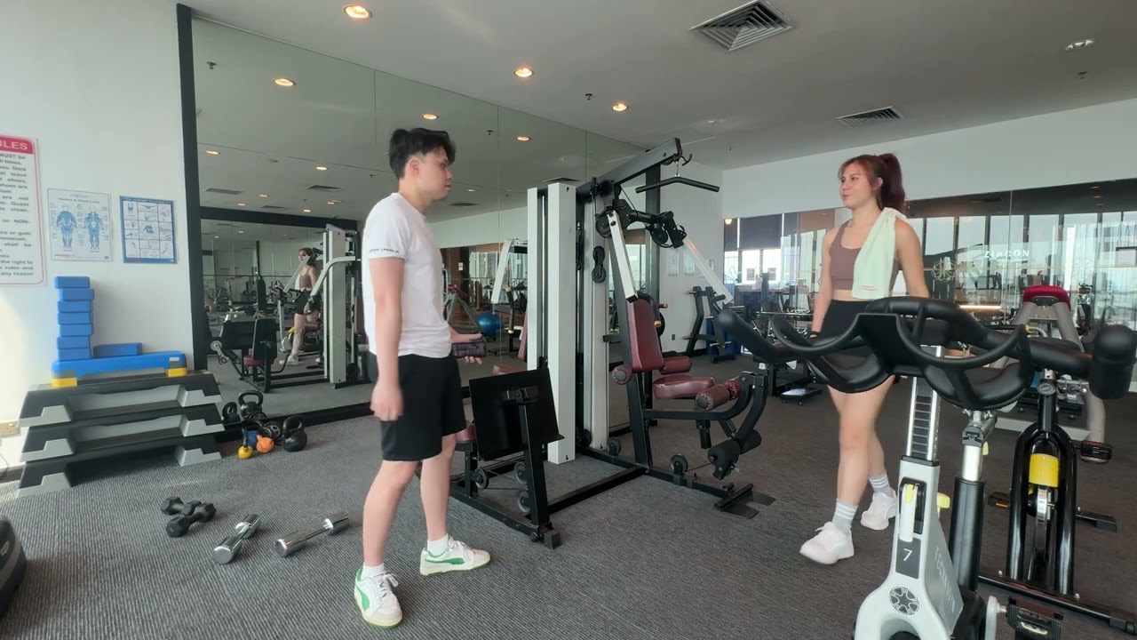
The video shows the app in use, bringing together the experience of the problem and the way InSync functions as a more supportive, action-based response.
InSync is a community-based fitness system that addresses how gym progress is often shaped by unhealthy social comparison within digital fitness culture. Through repeated exposure to curated fitspiration content and idealised aesthetic physiques, many gym-goers begin to measure their own progress visually, leading to dissatisfaction, reduced motivation and inconsistency in training. Rather than attempting to stop comparison entirely, InSync reframes how comparison should be understood and experienced.
The project shifts attention away from appearance-based evaluation and towards quantifiable gym progress through stats, sets, reps, workout frequency and shared effort. It proposes that progress can be recognised not only through how the body looks, but through visible action, accountability and consistency over time.
Developed through literature review, interviews, experiments and cultural probes, the project uncovered that even when gym-goers are aware that fitness content is curated or unrealistic, they may still feel emotionally affected by it. This highlighted the need for a more relational and supportive way of understanding growth.
As a design response, InSync takes the form of a buddy-supported fitness app and communication system that encourages users to sync workouts, track sessions together and stay motivated through shared participation and reward-driven consistency. By making effort more visible and progress more contextual, InSync offers a healthier framework for gym-goers to recognise growth beyond idealised aesthetic standards.


A set of supporting collaterals including the research publication, cultural probe archive and promotional brochure, communicating the research process and introducing InSync as a design response.
Advertising: Coffee Meets Bagel (School Project)

Campaign video for Coffee Meets Bagel, created as part of a school advertising project. The video introduces a gamified “bagel stacking” feature that encourages matched users to move beyond repetitive texting through playful icebreaker games, shared rewards and a real-life date opportunity.
Coffee Meets Bagel is a group advertising project that explores how dating app interactions can be made more meaningful, engaging and memorable. The project responds to the challenge of repetitive texting on dating platforms, where conversations can often become stale or lack depth. To encourage stronger connections between matched users, the campaign introduces a gamified “bagel stacking” feature that turns conversation into a shared digital experience.
Through the feature, users unlock different bagel ingredients by chatting, playing icebreaker games and completing interaction milestones together. As each ingredient is collected, matched users work towards building a virtual bagel stack, which can eventually be redeemed at Two Men Bagel House, creating a real-life date opportunity. This bridges the digital experience of Coffee Meets Bagel with a physical dining experience, reinforcing the idea of connection beyond the app.
The campaign extends across UI/UX, social media and an offline collaboration touchpoint, creating a cohesive experience that is playful, approachable and aligned with the brand’s focus on meaningful relationships. By combining gamification, conversation prompts and real-world rewards, the project reimagines how young adults can move beyond small talk and build connections through shared interaction.

A gamified Coffee Meets Bagel feature that encourages matched users to build conversations, unlock bagel ingredients and redeem a real-life date experience.

Social media visuals designed to extend the campaign beyond the app through playful prompts, polls and interactive bagel-themed content.
Re-Branding: SPCA (School Project)
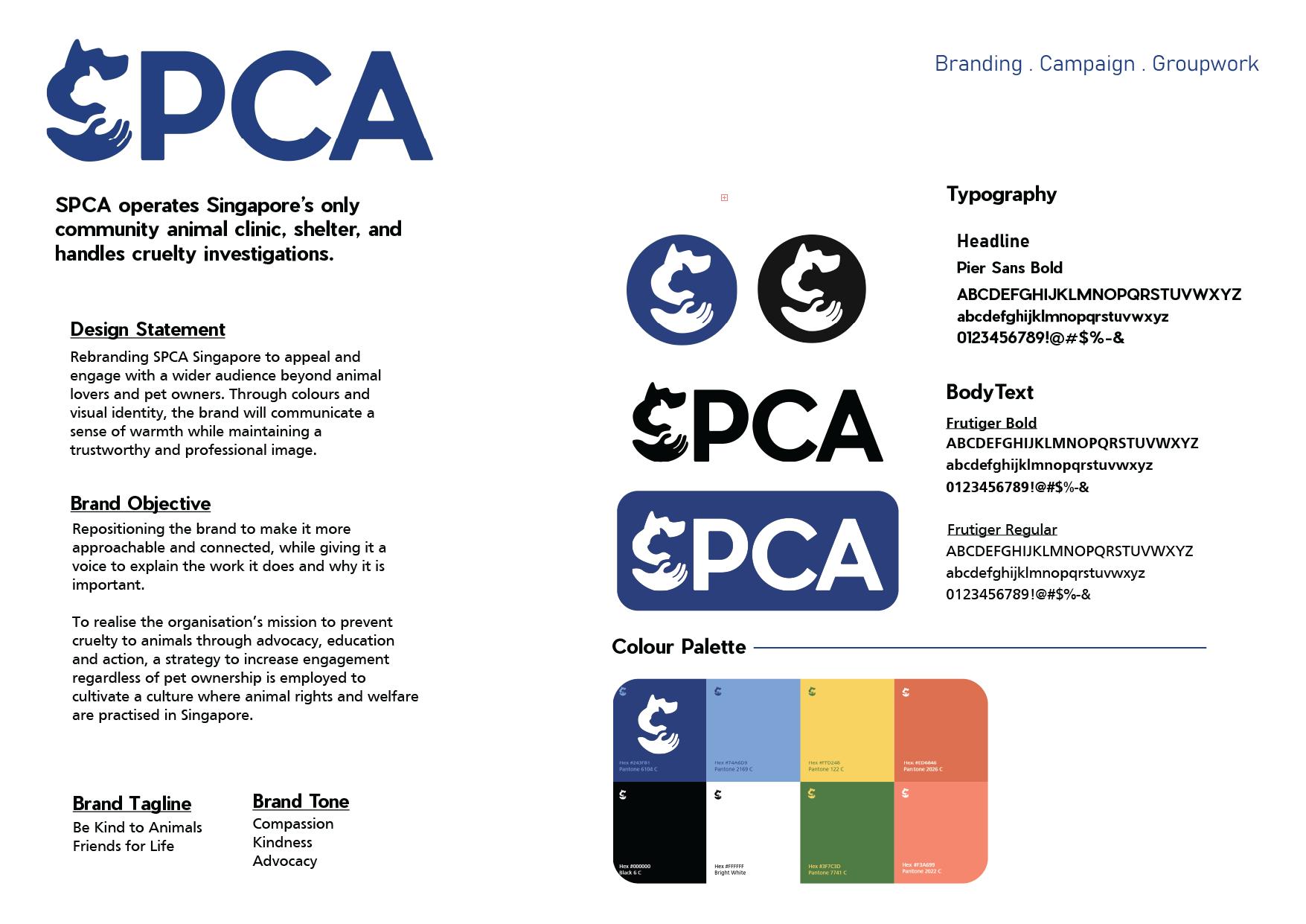
This group rebranding and campaign project reimagines SPCA Singapore’s visual identity and public engagement strategy to make the organisation feel more approachable, connected and emotionally resonant. While SPCA is widely recognised for its work in animal welfare, the project aimed to broaden public awareness beyond pet ownership by highlighting the organisation’s role in preventing cruelty, educating the public and encouraging collective responsibility towards animals in Singapore.
The rebrand introduces a warmer and more contemporary visual system while maintaining a sense of trust and professionalism. Through a refreshed logo, colour palette, typography and campaign language, the brand identity was designed to communicate compassion, kindness and advocacy. The campaign, titled #ItTakesASociety, extends this message through interactive touchpoints that invite the public to reflect on animal welfare issues and take small but meaningful actions.
A key campaign element is an interactive booth, where visitors can learn about animal cruelty, neglect and responsible care through fun facts, postcard takeaways and pledge-based activities. These physical interactions are supported by social media visuals that bring the campaign’s tone into a digital space, making the message more accessible and shareable. Together, the rebrand and campaign aim to strengthen SPCA’s presence as a caring, trustworthy and socially relevant organisation.


Gizelle Beatrix Arnold

Siau Xi Yu

Lee Pui Yee Rosalind

Trisha Saraogi
Lee Woosuk

Sandoval Averyl Pantoja