
About
Lee Seungyeon is a visual communication designer who explores overlooked subjects and translates them into visual form.
Her recent work combines visual storytelling with user interface design to surface emotions and hesitations that are often concealed.
She hopes to continue exploring such hidden narratives and expressing them in ways that feel both considered and sensory.
THE NOONCHI

Reading silence as a shared social language
by Lee Seungyeon
THE NOONCHI is a campaign exploring how silence is not weakness, but a social habit shaped by the pressure to read the room.
By reframing silence as a shared and culturally conditioned experience, the campaign creates space for conversations around what is often left unspoken, encouraging greater understanding and emotional openness.


Campaign postcards

Landscape poster

Campaign Instagram
Read Your Way (RYW)
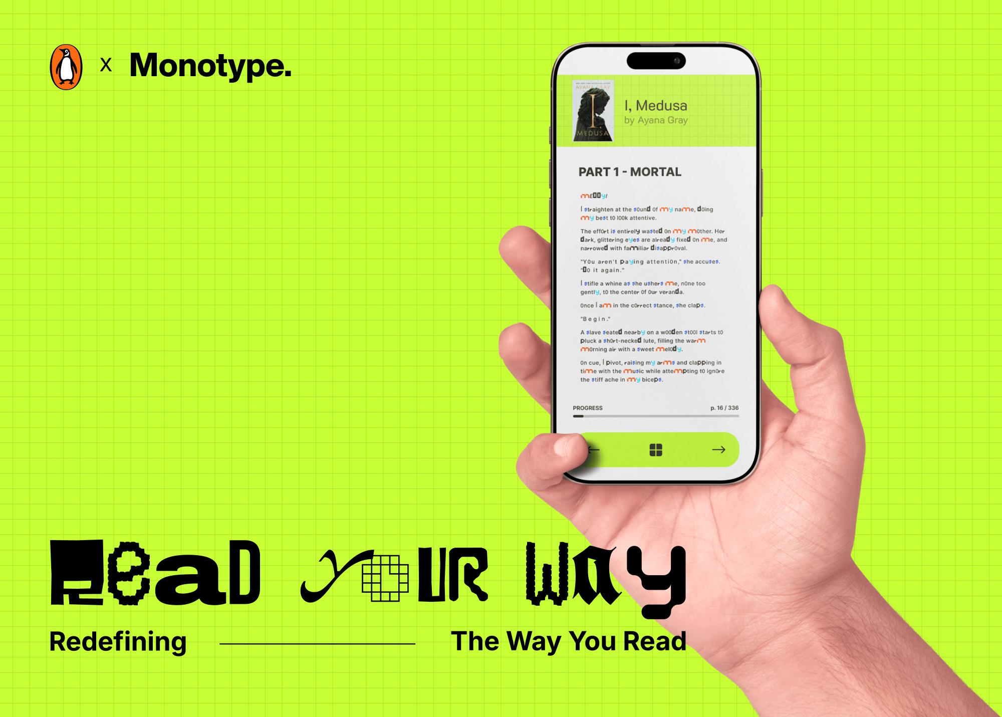
D&AD New Blood Awards Entry
While typography has always been a designer's decision, Read Your Way returns that control back to the reader.
A collaboration between Penguin Random House and Monotype, Read Your Way challenges publishing's oldest assumption: one typeface fits all.
From typeface and weight to kerning, spacing and colour, every typographic variable becomes adjustable, allowing readers to actively shape how words look, feel and land on the page.
This results not only in better readability, but a reading experience built around the individual based on their comfort, accessibility, needs, mood and expression.
Readers have always chosen what to read. Now they choose how to read.

Visual posters

UI app design
Living Harmony

Main visual posters
This project rebrands Singapore Archifest with the aim of reaching a wider audience and making the architecture festival feel more open and accessible to everyone.
It includes a main poster built on grids and collage, festival merchandise and a website that carries the same architectural mood throughout, where users can explore information about Archifest and view the festival map. The grid was not only used as a layout tool but became the visual language of the brand itself.

Festival website (UI)

Winna Tannesa
Andrea Lau

Idris Izzuddin Bin Affandi

Rhea Rahmat

Avika Chokhani

Htet Myat Thiri Shwe (Mya)
